

- Be prepared for any customer -
It can be difficult to let a customer know that the ingredients for their order aren't available and be up to date on the inventory in the restaurant.
Inventry is the solution to ensuring users have all the inventory required to assist anyone who enters their establishment. Below are some of the solutions
01.
View and update stock of all inventory.
02.
Place large or small orders directly from distributors.
03.
Manage and be connected to your team.
- Understanding the Problem -
Although there was a general sense of understanding of how inventory management can slow down stores and restaurants causing issues. I did not want to jump right into ideating concepts based on assumptions.
Instead, I wanted to understand as much of the inventory process and requirements as I could to ensure that the final product was valuable and effective to users.
- Research -
Following a user-centred design approach, I conducted interviews with 5 people who work within the restaurant industry. They worked in a variety of positions from new hires to management to thoroughly evaluate the problems faced within a restaurant from all angles.
When preparing the script, I ensured the questions were open enough for participants to elaborate on how they deal with inventory and the difficulties they face during stock or inventory days ensuring I learn their unique pain points.
Using the research, I organized the responses to find the most common pain points. Additionally from the feedback, I narrowed my scope to mobile apps because when updating and adding stock, the users were doing other work that is required within a restaurant. Mobility and portability are key.
The responses to the questions helped me create the following two personas.


Using the personas and information gathered, the below created a User journey map to reveal how most inventory and stock issues are caused by miscommunication, scheduling, and human error.


- Design -
Entering the design phase, I kept in mind all the information learned from the personas, pain points, and workplace observations. I started visuallizing the design by sketching out new concepts and creating a story board senario.


Using the paper wireframes and receiving some feedback from users, I created digital low-fidelity wireframes for the core functions of the app.


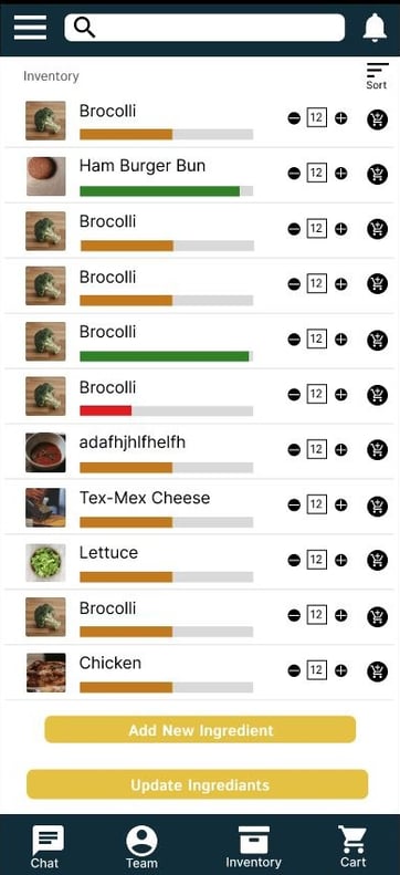
Visual indication of stock of each product to allow quick and accessible wat to confirm if restock is required.
Home page functionality to allow the user to update the stock count and add items to cart.
A direct function to read and automatically add low stock items to the cart, for a quick and easy ordering process.
A core function needed that was unavailable on competitor apps is a method that allows users to have direct communication with their team. From this pain point I added a chat and team management function on the app.


Quick access to the chat menu so the team can be connected from anywhere
A quick access bar allows the user to quickly go to their most used functions
Using the wireframes, I created a Low Fidelity Prototype ensuring the flows were user-friendly and efficient. The prototype focused on the primary user flowers placing orders for low-stock items and the essential team management and chat functions.
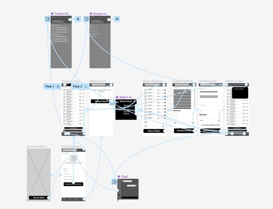
Using the prototype, I proceeded to do usability studies with 5 users who work within the restaurant industry,
The users did an unsupervised study to test the basic functions of the prototype and advise their unbiased opinions on the current state of the app.
After two rounds of usability tests, I confirmed some pain points that needed improvement.
Round 1
The Menu button and labelling are unclear and require updates.
Better processing notifications are need
Some menus are tedious and unnecessary
Round 2
The wording on add and update inventory is unclear.
The select store function was confusing to the user.
A more detailed update inventory menu is required
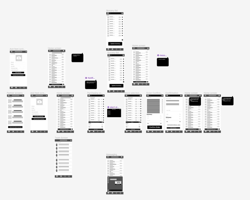
Using the user studies I updated and refined the prototype to ensure the user flow is clear and easy to use.
- Refinement -
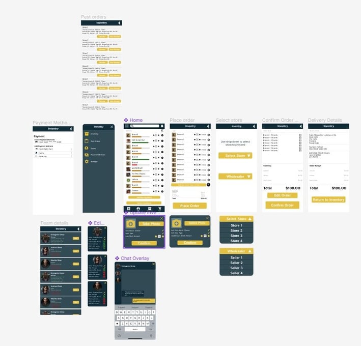
Using the low-fidelity prototype I created Mockups of the main user flows to design a simple, clear and professional app leading the user to the core functions.


Once the mockups were completed I created a Prototype of the app to allow the users to purchase new stock and view all the team management functions.

- Further Steps -
I am proud of what I have created but there are more revisions to be made to improve the app and use what I have learned to improve the app further.
Flesh out the rest of the Functions
Although my designs did provide solutions to the user's problems, it would be beneficial to add depth to the design and test new concepts to further improve the app.
- Design -
Entering the design phase, I kept in mind all the information learned from the personas, pain points, and workplace observations. I started visuallizing the design by sketching out new concepts and creating a story board senario.


Using the paper wireframes and receiving some feedback from users, I created digital low-fidelity wireframes for the core functions of the app.


Visual indication of stock of each product to allow quick and accessible wat to confirm if restock is required.
Home page functionality to allow the user to update the stock count and add items to cart.
A direct function to read and automatically add low stock items to the cart, for a quick and easy ordering process.
A core function needed that was unavailable on competitor apps is a method that allows users to have direct communication with their team. From this pain point I added a chat and team management function on the app.


Quick access to the chat menu so the team can be connected from anywhere
A quick access bar allows the user to quickly go to their most used functions
Using the wireframes, I created a Low Fidelity Prototype ensuring the flows were user-friendly and efficient. The prototype focused on the primary user flowers placing orders for low-stock items and the essential team management and chat functions.


Using the prototype, I proceeded to do usability studies with 5 users who work within the restaurant industry,
The users did an unsupervised study to test the basic functions of the prototype and advise their unbiased opinions on the current state of the app.
After two rounds of usability tests, I confirmed some pain points that needed improvement.
Round 1
The Menu button and labelling are unclear and require updates.
Better processing notifications are need
Some menus are tedious and unnecessary
Round 2
The wording on add and update inventory is unclear.
The select store function was confusing to the user.
A more detailed update inventory menu is required
Using the user studies I updated and refined the prototype to ensure the user flow is clear and easy to use.


- Refinement -
Using the low-fidelity prototype I created Mockups of the main user flows to design a simple, clear and professional app leading the user to the core functions.


Once the mockups were completed I created a Prototype of the app to allow the users to purchase new stock and view all the team management functions.


- Further Steps -
I am proud of what I have created but there are more revisions to be made to improve the app and use what I have learned to improve the app further.
Flesh out the rest of the Functions
Although my designs did provide solutions to the user's problems, it would be beneficial to add depth to the design and test new concepts to further improve the app.
Adding more team management functions
Throughout the research and studies I learned that the teams would prefer if there were management tools within the app to allow some members of the team to have access to different functionalities for example placing orders.
- Insights -
The importance of Planning
With a large problem in hand, I needed to plan the research and design process in order to narrow down the core issues users experience.
Understanding the user
Keeping the overall process user-centred has allowed me to ensure that I find the issues experienced by the user and that I solve their problems without adding any personal bias.
