Role User Experience Designer
Visual Designer
Tool Pen and Paper
Adobe XD
Duration May 2023 - June 2023
The Goal
Tut is an art tutorial website that collects and provides the best resources for students and professionals. It provided courses that can be used to learn topics from beginner to expert in all mediums and distinctions of art.
Artists have a variety of products they can utilize to learn and improve their skills, but due to the high variety, it can feel overwhelming and some content may not be up to par with the others.
The solution to this problem is Tut , a website that provides curated learning tools from courses, free videos, guides, and 3d models that ensures quality to help both veterans and beginners.
Understanding the User
To understand the user, I conducted user interviews to confirm if they would be interested in the product itself and what they look for when learning new things. Using the knowledge learned I generated empathy maps to better understand the target user and their needs.
Five users were sent questionnaires to complete unmoderated to ensure their unbiased and distinct opinion was provided.


Personas
1.
2.
3.
Navigation
Rating
Overwhelming
Video sites are filled with a vast variety of topics but are unsorted and , it can be difficult to find some content.
Users prefer to have a rating system integrated with the videos to ensure other users recommend the video.
Beginners have a hard time finding a way to learn the fundamentals in a more guided self disciplined way.
Most Common Pain Points of competitors
From the research, two personas were created based on pain points and the experience of the users researched.


Persona 1
Goals
To learn specific parts of a overall topic
Persona one is a professional concept artist, currently working in the industry and requires tutorials to learn new skills when need for work.
Frustrations
Has difficulties finding more specified and detailed items within an overall topic.


Goals
Frustrations
Persona 2
Persona two is a student, who is trying to switch careers and needs to learn the skills in order to be efficient in a professional environment.
To learn how to paint and draw without spending too much money.
There is so much information and it can be difficult to know where to start.
Design
Site Map
Art has a large variety of topics and mediums, one of the primary pain points was how unorganized websites were and the difficulty finding a variety of videos on certain topics.
My goal was to make sure the information provided to the user was more stream line , with the user being able to find any video on any topic from the home page.


Paper Wireframe
Next, I sketched out a paper wireframe for each screen in the app, ensuring the user pain points were accounted for.
The home page paper wireframe variations assisted in testing and moving elements around to ensure that all


Screen Variation
Because the site can be used on a variety of products with different screen sizes. The website screen was translated to be usable on mobile for users on the go.


Digital Wireframes
Moving from paper to digital wireframes made it easier to understand how the site can help address user pain points and improve user experiences.
Prioritizing useful focal points and visual elements on the home page was a great focus of my strategy.


Easy sorting that allows user to quickly find specified information
Easy access to viewing courses and learning tools.
Digital Wireframe Screen Size Variations


Low Fidelity Prototype


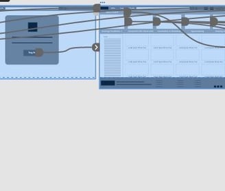
When creating the low-fidelity prototype, I connected all the screens involved in the primary user flow of creating an account and starting a course.
Using the information learned from the competitive audit, I compared the best practices and implemented them into my design.
Usiblity Study
Using the low-fidelity prototype a remote usability study was done to find any pain points a user may be affected by.
5 users who were both interested in art and people with experience in professional fields tested the main user flow. From the tests, the users showed confusion using the home screen but stated that the signup process felt smooth.
After synthesizing the user notes I began to refine the design and create a mockup of the final.


Mockups
As the users had issues with clarity, I made sure to use hierarchal fonts, and pops of colour to have a better user focus to ensure the website and app are readable.


Before Usability Study
After Usability Study
Usiblity Study


Through the test, a user stated that starting the course was very sudden, so a course information screen was added for users to have more information prior to starting the course.


Mockups: Screen Size Variation


High Fidelity Prototype
The hi-fi prototype followed the same user flow as the lo-fi prototype, most of the changes implemented were regarding the visual design and placement of elements


Accessibility Considerations
Using contrasting colours, ensures the user can see the key elements of the site for a clear hierarchy.
Users are able to use their mic to have the ability for voice-only search.
Reflection
In this project, I learned that providing clear and descriptive information on the home page can greatly improve the user experience, instead of providing all functions of the site it is better to organize and provide the most useful functions
As I proceed with the design of the site I will be fleshing out the tools section to provide a well-rounded learning experience for users.
